Detectors and DLVAs
Reading a Detector Plot When the Color Is Gone
A curve that lives only in color is a curve that does not survive the photocopy.
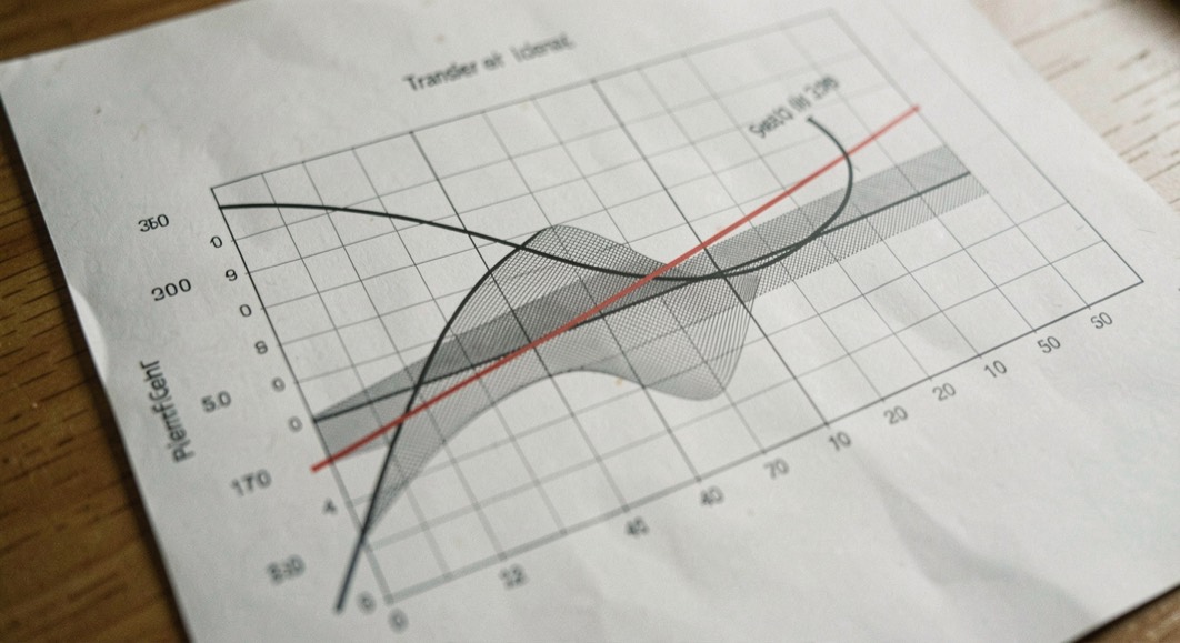
A detector plot is read for one thing: the shape of the line. A slope, an intercept, and the gap between the measured curve and the ideal straight line. None of that survives if the only difference between two traces is their color. A curve that has to be read on paper, in a photocopy, or by a reader who cannot separate red from green needs its information carried somewhere else, and the repair is not a redesign of the chart. It is a set of habits a bench can adopt in one afternoon.
Why does a plot stop working when the color goes?
Color is the cheapest channel a plotting tool offers: two series, two colors, finished. It is also the channel that fails first. A grayscale copy flattens two hues into two greys that can sit within a few percent of each other, a printout read under a dim lamp does the same, and a projector washes the difference out entirely. A reader with a color vision deficiency sees the two categories collapse earlier than any of that happens.
Teams that keep pages rather than plots meet the same problem with photographs, charts and forms, and the rules they work to are collected under church website accessibility, a magazine written for the volunteers who maintain parish sites. Redundant coding, sufficient contrast, text that does not depend on an image: the list is the one a bench needs as well, applied to a different sheet of paper.
The bench version of that rule is older than the software. A test record is written to be read by someone who was not in the room, and the plot is part of the record. A curve whose traces are told apart by hue alone is a curve with one trace missing from the copy.
What color carries, and what has to carry it instead
Color on a plot is doing three jobs at once, and separating them is what makes the repair obvious. It says which series a line belongs to. It says which of two crossing lines is in front. It says how a family of curves is ordered, as when one parameter steps from trace to trace. Each job has a substitute that survives grayscale, and the substitutes are additive: a figure can carry color and the other channels at once.
| Channel | What it distinguishes | Where it fails |
|---|---|---|
| Color | Series identity at a glance | A grayscale copy, dim light, color vision deficiency |
| Line style | Series identity through dashes and dots | Very short traces, where the pattern has no room |
| Marker shape | Series identity at each plotted point | Dense data, where markers overlap |
| Direct label | Identity and order in one word | Traces that cross more than once |
| Order in the legend | Reading sequence of a family | A reader who arrives at the figure from the caption |
| Caption | What the reader is meant to see | Nothing, if it describes the figure instead of pointing into it |
How do you label a trace that has no color left?
Direct labeling pays the most for the least work. Put the name of the series at the end of its own trace, on the plot, instead of sending the reader to a legend and back. A trace labeled where it ends is identified by position, which no copy takes away. Where two traces cross, the label belongs at a point where they are apart. Where a family is ordered by a parameter, the value written beside each trace turns a legend lookup into a reading.
After direct labels, line style and marker shape carry the rest. A solid line against a dashed one survives a fax, a photocopy and a photograph of a screen. Adding a marker to the style separates more series than either channel alone. The limit is density: on a trace of a thousand points a marker per point is a smear, so markers belong at intervals.
What a caption owes the curve
The caption is where plots usually lose the reader. A caption that says what the figure is, a transfer curve or a return loss sweep, leaves the analytical work to the reader. A caption that says what to look at, and where the departure from the ideal line is largest, does that work for every reader at once, on paper and on screen, and it is also the text a screen reader announces. The web accessibility guidance is explicit on the point: the use of color criterion in the Web Content Accessibility Guidelines requires that color not be the only visual means of conveying information, and a caption is the cheapest way to satisfy that on an instrument plot.
The reader who was not at the bench
A plot inside a qualification record has readers beyond its author: the reviewer who signs it, and the engineer who repeats the measurement years later. Neither was at the bench when the trace was drawn, and neither can ask what the second line was.
That is the whole argument for redundant coding, and it costs a few minutes at the point where the figure is exported. A return loss sweep compared against a limit line is the same problem in a different shape, and the limit belongs on the plot as a labeled line rather than in the text of a paragraph. The vocabulary a plot shares with a datasheet is collected in the glossary of control terms, and the column each figure belongs to is set out in the datasheet parameter index.
Common mistakes
- Distinguishing two traces by hue alone, then exporting the figure to a document that is printed in black and white.
- Writing a caption that restates the axis labels instead of naming the feature the reader should find.
- Adding a marker to every point of a dense trace, which merges the styles it was meant to separate.
- Leaving the limit line out of a return loss plot and stating the limit only in the surrounding text.
- Assuming that a figure readable on the screen where it was made will be readable in the record it enters.
Before a plot leaves the bench
- Check that each trace can be identified with the color information removed.
- Label the traces directly where they are apart, and keep the legend only as a fallback.
- Draw the limit line, and label it, wherever a measured curve is compared against one.
- Write the caption last, and make it name the feature the reader is meant to find.
- Print the page in black and white once, before the figure enters a record.
The habits cost nothing on the screen and change everything in the archive. The quantities a plot is read for are set out in reading a log detector transfer curve, and the same reflection applies to a reflection measurement read against a limit, as described in VSWR and return loss.